How to build a responsive web app with Material-UI


In this article, we will be learning how to build a responsive web app using Material-UI on top of ReactJs.
N:B Will be referring to Material-UI as MUI
So what is MUI you asked, MUI is an open-source React component library that implements Google’s Material Design which includes a collection of prebuilt components.
As a Frontend Engineer, you will agree with me that aside from building an interactive web app with logic, there are other areas as well to be worked on in which Responsive web design is part.

Responsive web design allows your content to flow freely which can either be text, videos, images, etc. across all screen resolutions and sizes in making them look great on devices.
Before now building responsive web design can be achieved with media queries in CSS but in this article we will see how to achieve the same using MUI.
So I will be using CRA (create react app) in creating our application. So open your terminal and key in the below command.
npx create-react-app mui-responsive-web-app
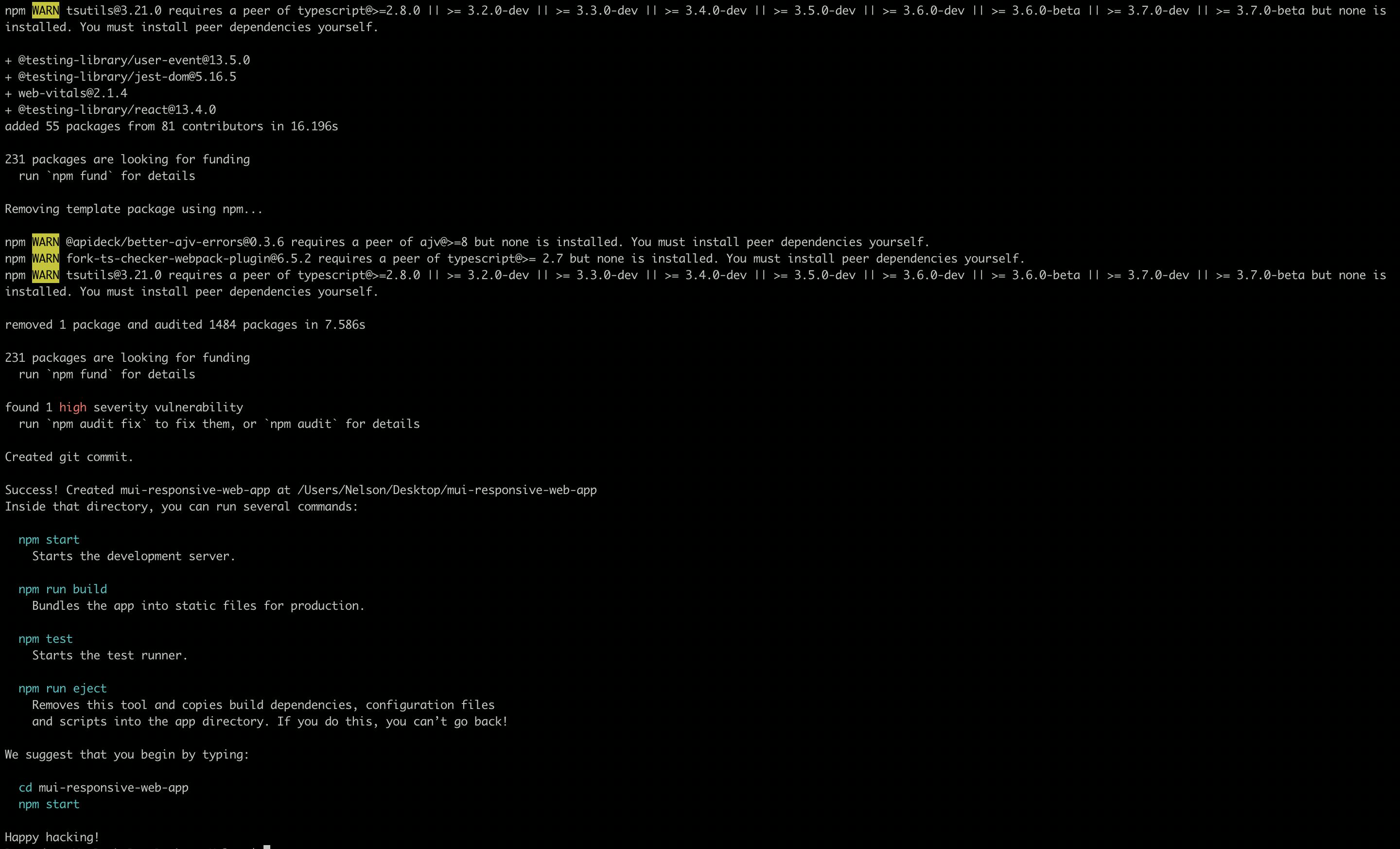
If created successfully you get to see the “Happy hacking!” message on your terminal, next is to cd into the directory and install MUI with the below command either using npm or yarn
npm install @mui/material @mui/styled-engine-sc styled-components
MUI uses breakpoints to determine specific layout requirements which adjust to suit the screen size and orientation using keys like xs sm md lg xl which the values can still be customized.
In building a responsive web app in CSS, media queries are been used but in MUI media queries are exposed out of the box using the theme.breakpoints properties which includes:
theme.breakpoints.up(key): this query matches the screen width greater than the screen size given by the breakpoint key i.e styles will be applied to value after max-width upwards.
theme.breakpoints.down(key): this query matches the screen width less than the screen size given by the breakpoint key i.e styles will be applied to value before min-width downwards.
theme.breakpoints.only(key): this query matches the screen width starting from the screen size given by the breakpoints key and stopping at the screen size given by the next breakpoints key i.e styles will be applied to values within the min-width and max-width.
theme.breakpoints.not(key): this query matches the screen width stopping at the screen size giving by the breakpoint key(exclusive) and starting at the screen size giving by the next breakpoint key(inclusive) i.e styles will not be applied to values within the min-width and max-width
theme.breakpoints.between(start, end): this query matches the screen width greater than the screen size given by the breakpoint key in the first argument (inclusive) and less than the screen size given by the breakpoint key in the second argument (exclusive) i.e styles are applied to values within the first key and second key.
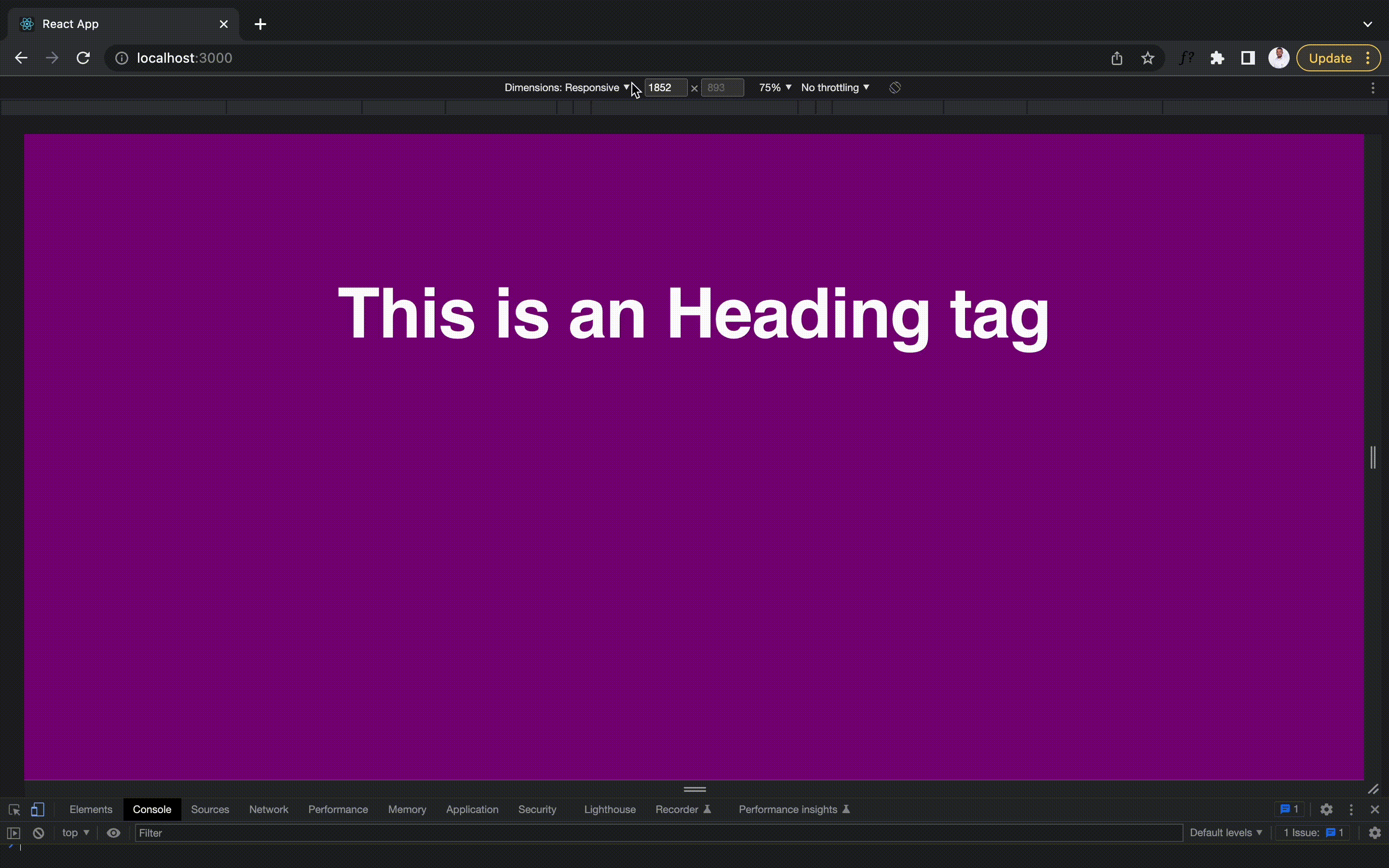
So now that we understood the MUI breakpoints let’s see how we can change the app background and text font size inside the app.js file using the styled component approach.
import Box from "@mui/material/Box";
import Typography from "@mui/material/Typography";
import { styled } from "@mui/material/styles";

const Wrapper = styled(Box)(({ theme }) => ({
  background: "#1976d2",
  height: "100vh",
  [theme.breakpoints.down("md")]: {
    background: "orange",
  },
  [theme.breakpoints.down("sm")]: {
    background: "blue",
  },
  [theme.breakpoints.up("lg")]: {
    background: "purple",
  },
}));

const Heading = styled(Typography)(({ theme }) => ({
  textAlign: "center",
  color: "white",
  fontWeight: 600,
  paddingTop: "2em",
  [theme.breakpoints.down("md")]: {
    fontSize: "1.5rem",
  },
}));

function App() {
  return (
    <Wrapper>
      <Heading variant="h1">This is an Heading tag</Heading>
    </Wrapper>
  );
}

export default App;
Below is the end result